
Client: McCormick
Company: R/GA
Role: Strategy, Experience Design, User Journeys, Sketches, wireframes
Year: 2013-14
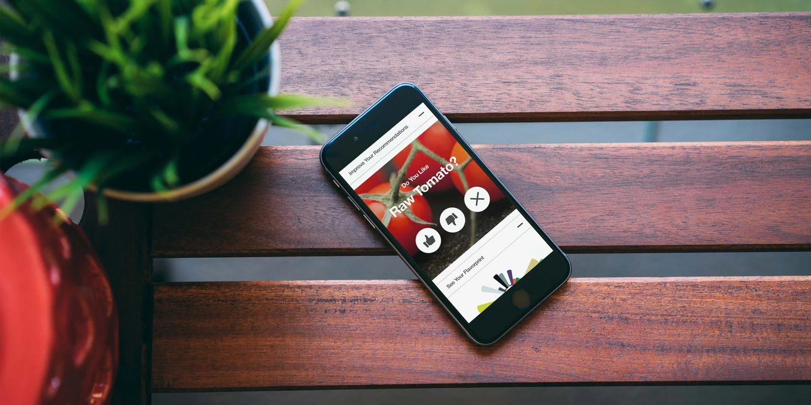
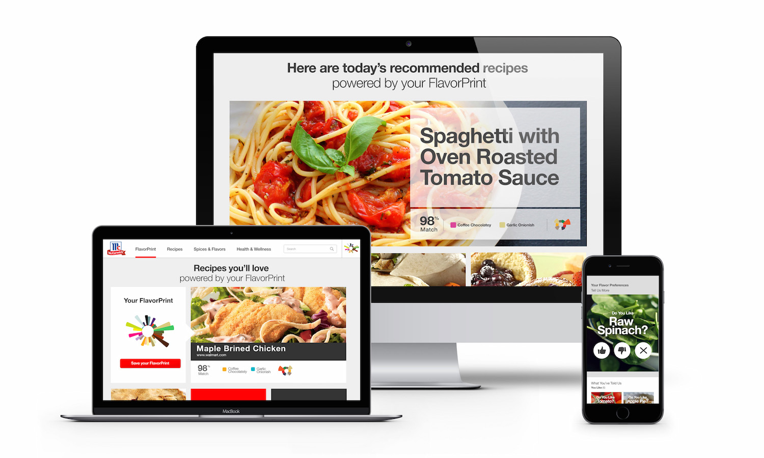
FlavorPrint is a service that allows people to experience cooking through their flavor preferences. Based on flavor science, it breaks down dishes by 33 flavors gives users recipe recommendations based on their unique FlavorPrint mark. It also pulls out the top flavors in each recipe, allowing the user to easily compare them to their own top flavors which are represented in their unique FlavorPrint mark. As users give input about which flavors they like or don't like along with information about what supplies they have on hand, cooking methods they prefer, and equipment they own, their FlavorPrint mark becomes more accurate and the service develops smarter recommendations.
I led the UX design on the team that revisited the the original FlavorPrint experience in order to improve the service even further. This required auditing the current responsive site experience, looking at the existing strategy and target audience to identify the opportunity for FlavorPrint to evolve, and then redesigning the FlavorPrint section of the McCormick site to be even more informative and user-friendly. This project required close collaboration between myself and the awesome visual designer, Rachel Mitnick, in order to complete the deliverables within very tight deadlines.

I helped with strategy and conducted my own secondary research to understand and communicate where FlavorPrint fit into the landscape of food recommendation tools. I was responsible for researching competitors in the space and completing an audit to describe the attributes of each service, pulling out differentiating factors. After researching, I created various maps and diagrams to communicate the opportunity for FlavorPrint to the team and client.

After researching, I wrote out user journeys based on personas to get into the mindset of the user and see where the FlavorPrint service could have more helpful interactions and meaningful touchpoints. For example, the journey a working mom whose go-to dinner is chicken and is sick of making it the same way every week. She uses FlavorPrint to quickly navigate through recipes to find something she and her kids will like. The service allows her to find the ingredients she needs and automatically add them to a shopping list for when she heads to the grocery store next. These journeys were based on brand personas that were already established by planners working on the account.


At the end of the day, FP is a recipe recommendation engine, so the goal for the user it to find a recipe they’ll like, so I went back to the root goal asked myself the question: What would be a better way for a user to find a recipe that matches their preference? I played with the verb ‘find’, switching it out for ‘search’ and ‘browse’. That simple tweak on the user’s action and mindset helped me to brainstorm new kinds of interaction models.
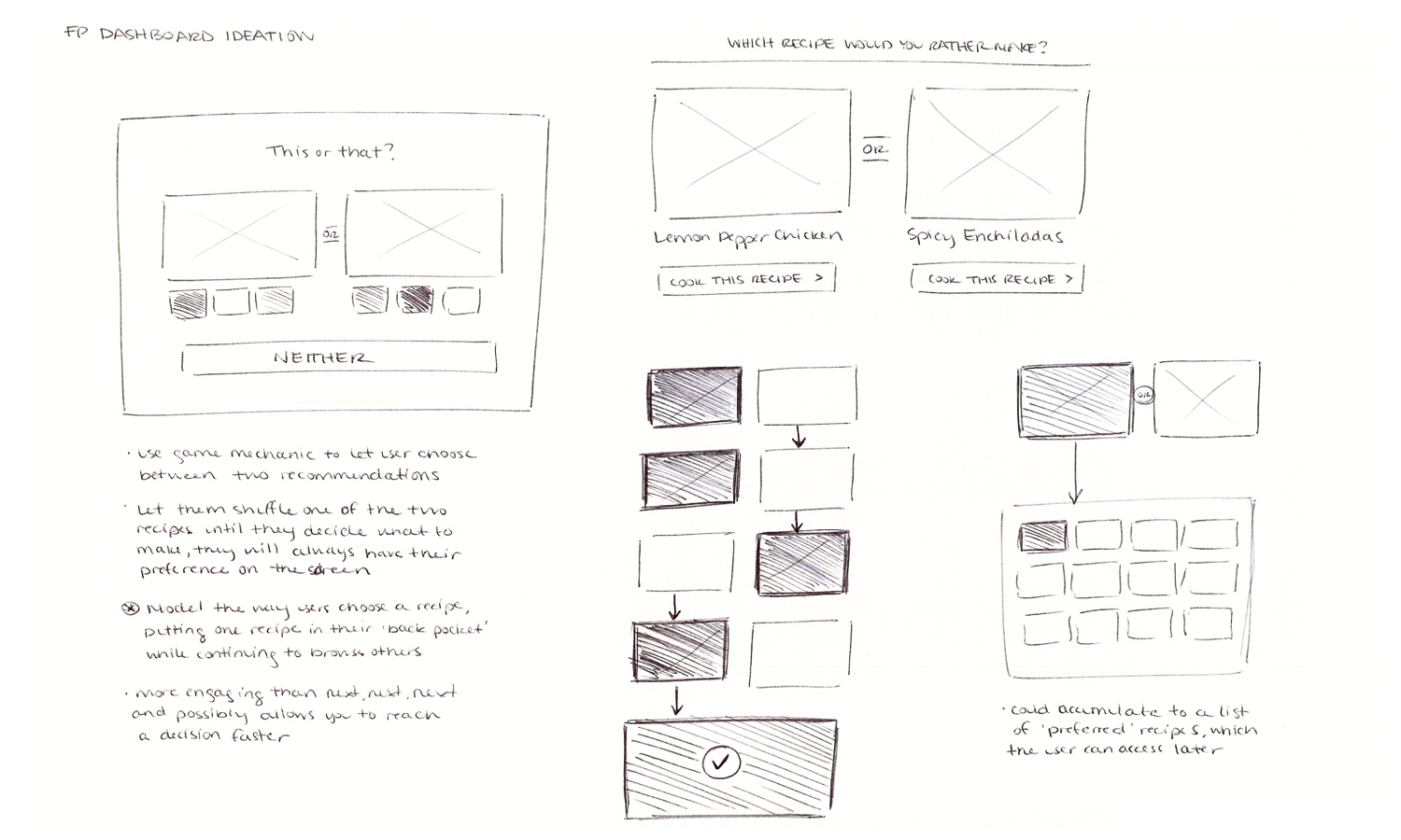
One of my favorite ideas for a browse model was what I called the ‘Back Burner Browse’. After doing some guerilla-style user interviews and thinking about my own experience with recipe sites I was intrigued by a particular behavior that kept coming up. When users are looking for a recipe, they will enter into a recipe browsing experience through search or categories. If they are interested in a recipe, they will open it in a new browser tab and then toggle back to the recipe continuing browsing. If they find a recipe they like better than the first, they open that one in a new tab and close the previous, essentially keeping their top preference on the ‘back burner’ to sit there until they came across something better.
So I thought about how that behavior could be used to structure a recipe browse experience and sketched it out. The interface displays two recipes side by side and below them is a ‘Neither’ button. FlavorPrint would populate the two initial receipes based on what it knows about the user. The user simply selects which recipe they like better between the two, this-or-that style. The recipe they choose remains and the other recipe changes, this way the user can hold onto their preference while quickly browsing other. If they don’t like either recipe they can select ‘Neither’ to shuffle both. Keeping their preference in view eliminates the need for them to open a new tab and reduces decision fatigue by simplifying the user’s choices. It also makes the FlavorPrint mark useful by keeping the comparison simple - highlighting the top flavors in the recipe.

I sketched out user journeys for the future of FlavorPrint to talk through with the client, I also introduced hand sketches into the relationship with our client on a regular basis which really helped us to receive better, more focused feedback earlier on in the design process.
I heavily emphasized the importance of a mobile-first approach for this project. The client was not used to working that way so it required patience and persistence, creating multiple versions of each page helped show and explain the differences more effectively. The user’s revamped FlavorPrint dashboard was a great example of this, where the team worked with the client to understand the priority of the page from a business perspective and balance that with what the user would value most starting with the mobile users.


The team’s deliverable was a complete set of responsive designs for the FlavorPrint experience. I was responsible for creating a systematic set of high fidelity wireframes. The visual designer and I worked in tandem to solve for layouts and hierarchy. Below is an example of this, showing the evolution of the FlavorPrint landing page that explains the service to new users. It was a storytelling exercise and after working through the structure of it in sketches, thinking through what should be shown and stated, I explained the goal of each section to the copywriter and visual designer and worked with them to create the final page.

