

Client: Equinox
Company: R/GA
Role: Ideation, user journeys, Experience Design, wireframes, prototypes, guerrilla user testing
Year: 2014
How do you help people track and understand their activity in a holistic manner?
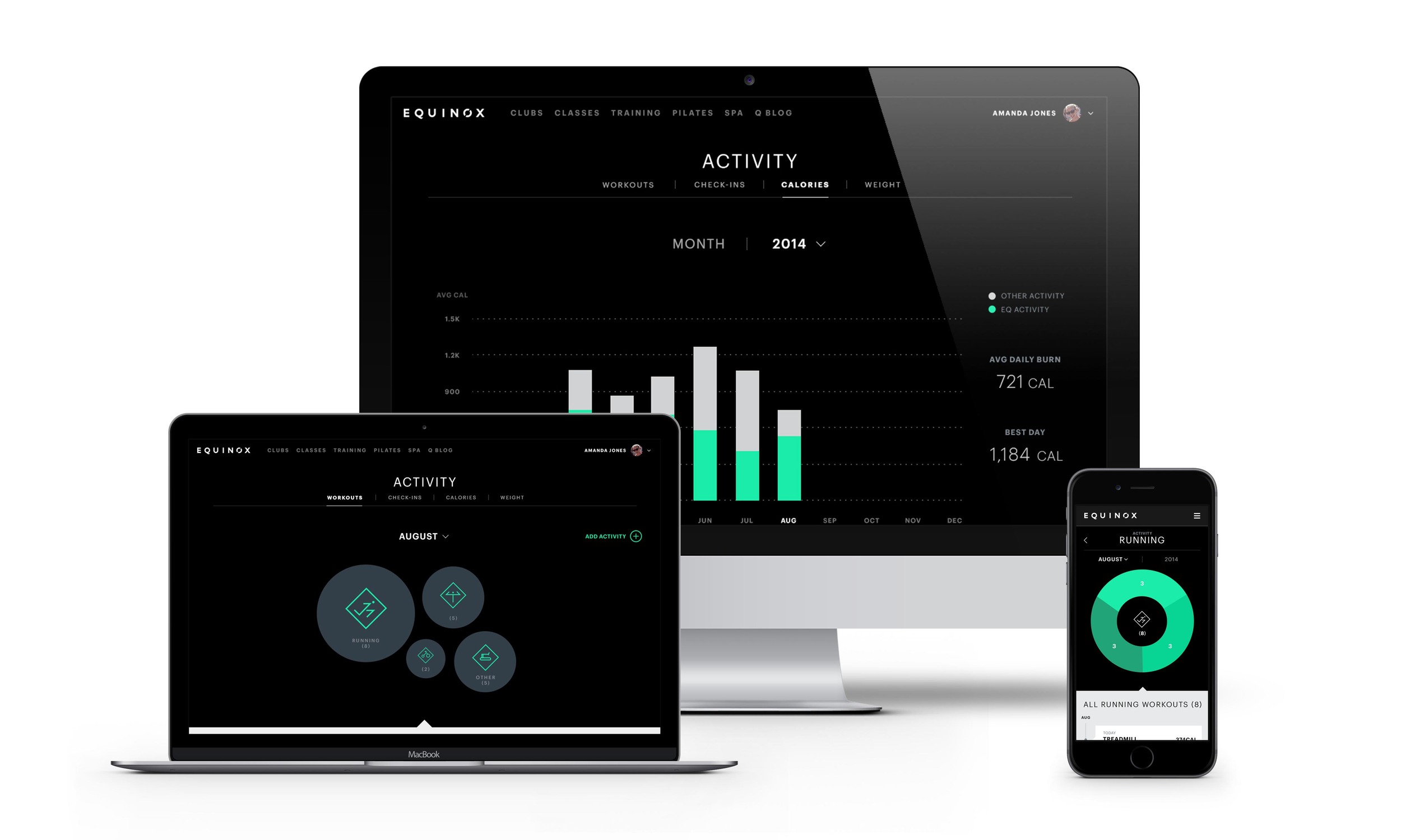
For this project, I was asked to help design an updated activity profile for Equinox users. This profile tracks all of the user's activity including workouts, calories burned, and classes attended and visualizes this information in detailed graphs for a spectrum of fitness enthusiasts to understand their progress. This experience was also designed to be flexible enough to incorporate health data from third party sources by connecting to Apple HealthKit.
Throughout this project, one of the biggest challenges was deciding how much information to display in order to include what the client requested while still being reductive to make complex information simple for the user to view. We would constantly ask ourselves, “Does this help the user understand ____ better? If so, would that still be clear if we removed ____ from the screen?”
The user’s activity profile has 5 main sections: Workouts, Check Ins, Calories, Weight, and Sleep. Each section has associated graphs and the ability to view data from past months and years. I preferred to problem solve through hand sketching and went through hundreds of pages of sketches try to figure out the intricacies of the navigation, graphs, and activity upload flows. Hand sketching to work through my ideas really encouraged the rest of the team to do the same. I even printed out mobile templates that we used for sketching sessions where we all sat around a table and sketch in 5 minute intervals to solve a screen. Then we’d discuss the options we all came up with to explain our thought process and I would use that discussion and the sketches to create the screen in higher fidelity wireframes.

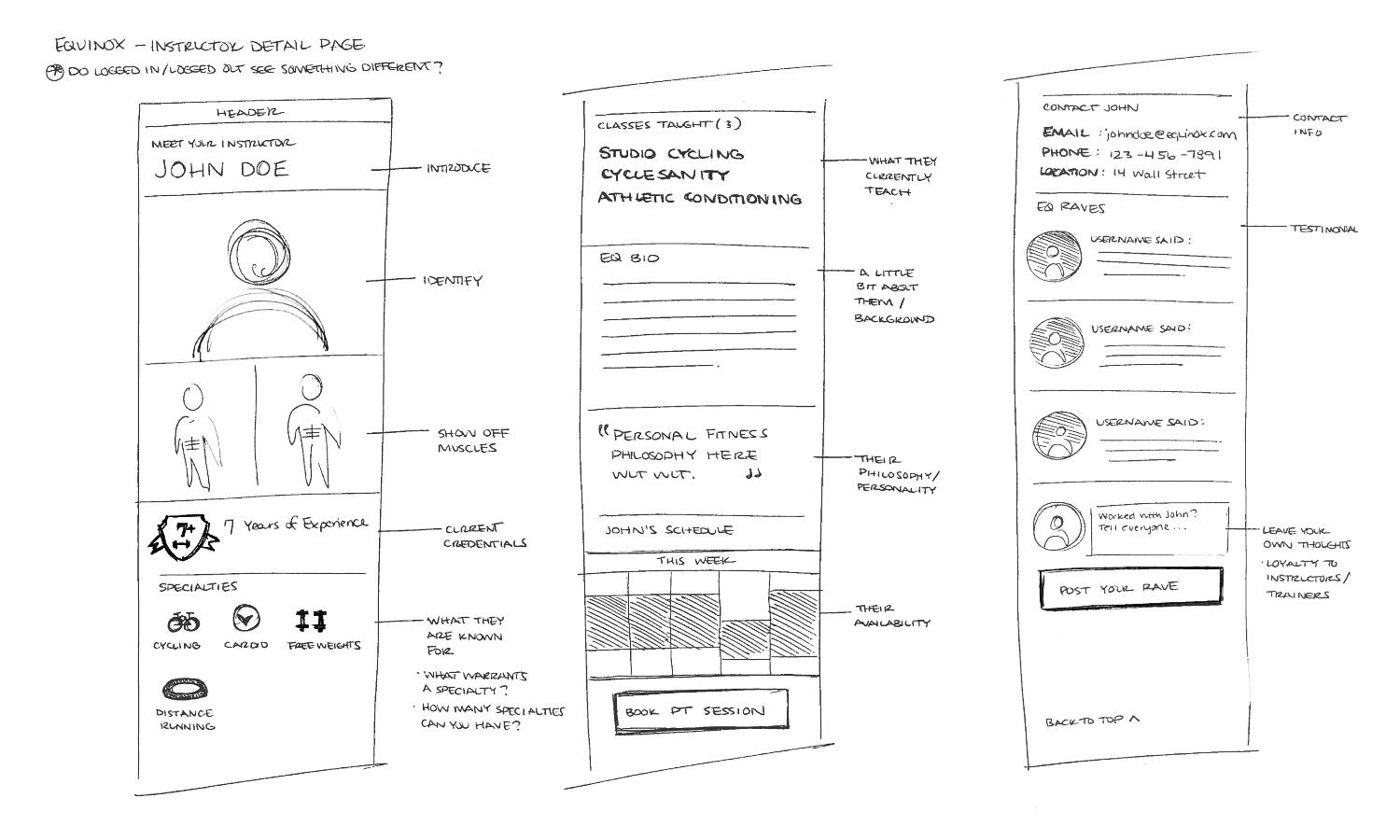
One example of a sketch session was when we were thinking about a new activity landing page structure. We chatted beforehand about what we generally needed to include on the page such as an activity summary view of movement, nutrition, regeneration, but it was up to us what that summary looked like. Was it showing a day view? The current week? Were there visual elements to categorize? Could you expand to see more? Drawing it out really helped the communication between designers and other team members as well and made everyone’s thoughts more accessible.

Because there were a lot of components in the activity section and therefore a lot of interactions that we wanted the user to understand, we started thinking early on about how we would onboard and inform the user. It was important to make it feel as seamless and light as possible because activity was only one section of the website or app.
Keeping this in mind, we ended up going the route of coach notes to explain some of the key interactions to help the user learn progressively. We set rules for their timing so that they wouldn’t all appear at once and also to reappear after a certain length of time if the user hadn’t tried one of the key actions, such as navigating between the sections or tapping to view a class detail. While coach notes are not always ideal, the client was comfortable with the their implementation and they offered flexibility for us to easily modify what information we gave the user as the work progressed.

There are 4 main types of activity tracked for the user:
Classes/Personal Training: The user took a cycling class at Equinox
Custom Workouts: The user played basketball for an hour
Machine Workouts: The user went on the elliptical for an hour
Third-Party Workouts: The user went on a run with Nike+
These activities fed into the ‘Workouts’ page in their profile, the landing page of the experience, and populated a collection of category ‘bubbles’ followed by a feed of the user’s activity. Each bubble represents one category, such as running or yoga, and the size of each bubble correlate to the amount of activity in that category. The idea was that the user could get a sense of their activity balance and breakdown at a glance. From this screen the user could dive into a single category to view more details. This category detail page displayed all of the user’s activity within a single category and allowed the user to see the breakdown.
One of the main advantages of tracking workouts through Equinox for the user is that they could connect their 3rd party device such as FitBit or Nike+ to their profile and pull in any activity tracked, providing a more holistic view of their fitness. Each of the user’s activities would generate an activity item in their feed. So if the user was viewing their ‘running’ category, they could tap to view how many runs they completed in a running class at Equinox versus how many Nike+ runs they went on. The user could drill down even further into a workout summary page to view and input information associated with the workout, such as calories burned and intensity. We worked with the client to figure out what information would be available for classes and the different types of activity, and then I annotated what each instance of a feed item would display based on that information.


One of my major contributions was working on a feature to allow users to add their custom workouts. There was an uproar from users when the new Equinox app launched months prior because it removed the ability for users to input data related to any workout that was at the gym but not a scheduled class workout, such as running on the treadmill or elliptical machines. I was tasked with designing this flow and integrating it into the existing activity section.
In approaching this, I talked with the client about what the old custom workout flow included and what data they allowed users to input because I wanted to understand what the user’s previous experience was. From there, I did a brief audit of activity upload services that were either manual or used OCR to figure out what information was standard to log a workout. Then I focused on what the flow of inputting information would be and the hierarchy created based on the order - date, start time, duration, the activity, a dynamic field based on activity selected, calories, and notes. I wanted this flow which was essentially a long form to feel very approachable and as quick and easy as possible - maybe someone was inputting this quickly right after working out, maybe they would do it on the commute home.
There were three main factors I played with 1.What could be pre-populated? 2.What fields did the user need to see upon arrival? 3.What actual interaction or input type would be the fastest for each field? My process here was to create a version, make a prototype in InVision and put it in someone’s hand, asking them to pretend they had to add their workout and have them talk me through their thoughts. This guerrilla testing was helpful in revealing when the order was confusing or when the user expected a field to work differently than designed. Something that people unanimously liked were the ‘quick duration’ buttons I added because they reduced the need to pull up the keyboard and type out a number.


Figuring out the navigation was another fun design challenge. On the mobile web view, we had to get creative because there were a lot of elements to include. We needed to display a header to let the user know what section of the site they are viewing, a navigation for the sub sections within activity, a navigation to toggle between month and year views, and then a selector to choose which year/month is in view - defaulted to the current. If we simply stacked the four elements, the navigation would take up almost half of the screen below the status bar and site header.
So instead I thought about how we might able to try something new. Working very closely with the visual designer, we played with the idea of combining the month/year to be displayed as a combined toggle and dropdown control - tap once to toggle, tap twice to access the dropdown. So if the user selected ‘year’ the graph would shift to display a year view and the current year would display, then the user could tap again to look at the graph for a previous year. I built out InVision prototypes for this as well and the client responded very well to them, making it easier to get approvals.

The lovely designer Ellen Pai did the visual design. We worked very closely from concept to execution and I learned a lot from discussions and critiques with her as we worked through the complexity. It was a joy to work with someone so talented and approachable. While in some instances my wireframes heavily influenced the final design, in others she improved upon them and worked with me to finesse the details and brought the screens to life.

